Lurking beneath the seemingly-chaotic design of We Love Pop is an actually-pretty-strict grid system. I know! I can't believe it either, and I created it. (The trick is to make everything look lovely and neat to begin with, then MESS IT ALL UP right at the end). I ended up redesigning the magazine several times over the years, and these pages are some of my favourites.
This "little bit of everything" feature was one of the last things I designed for the magazine before I left, with a brief to create something a bit cool and edgy that could have just as easily come from a tendy fanzine or snoot style mag as We Love Pop.
My advice to all of you would be to make sure that any handwriting font you pick doesn't have a really horrible 'b' that doesn't even look like a 'b'.

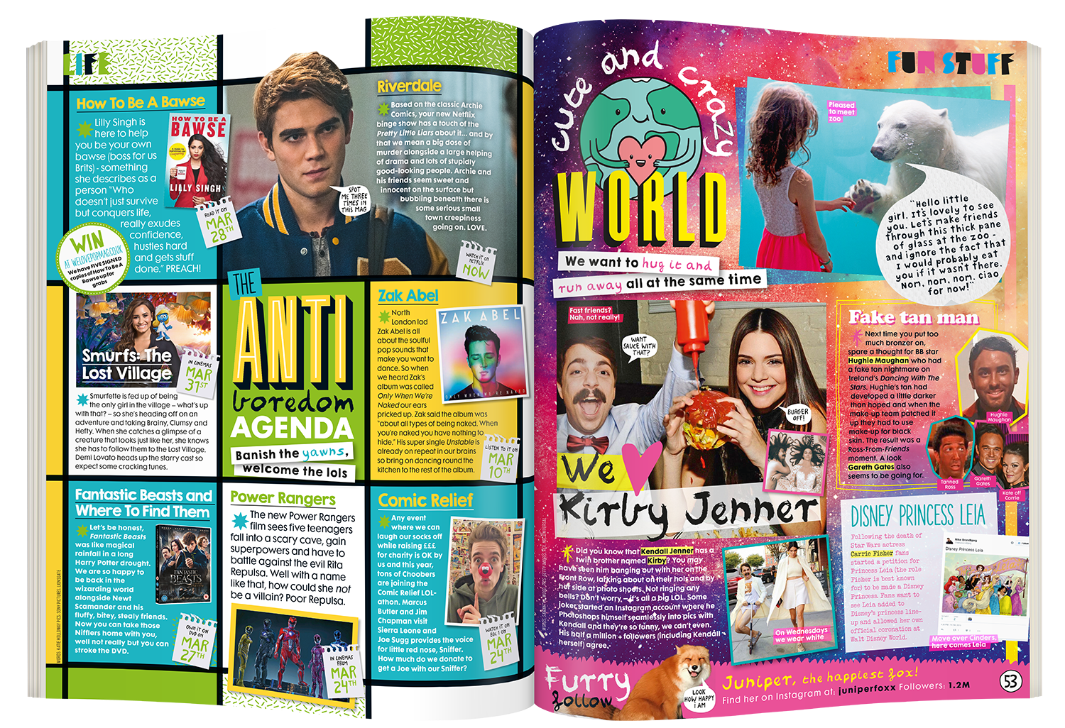
This spread was introduced at the very peak of the moustache trend in 2014.
These two pages are both designed on the same 12-column grid, although one of them is a bit more obvious about it than the other.

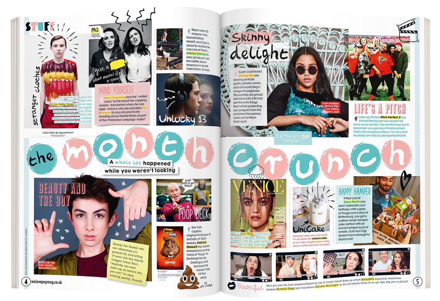
Making a feature that's a big, mad old jumble of loads of different pictures isn't as easy as it looks, you know. You often get to the end and realise you've forgotten to drop in the warrior beaver viking.
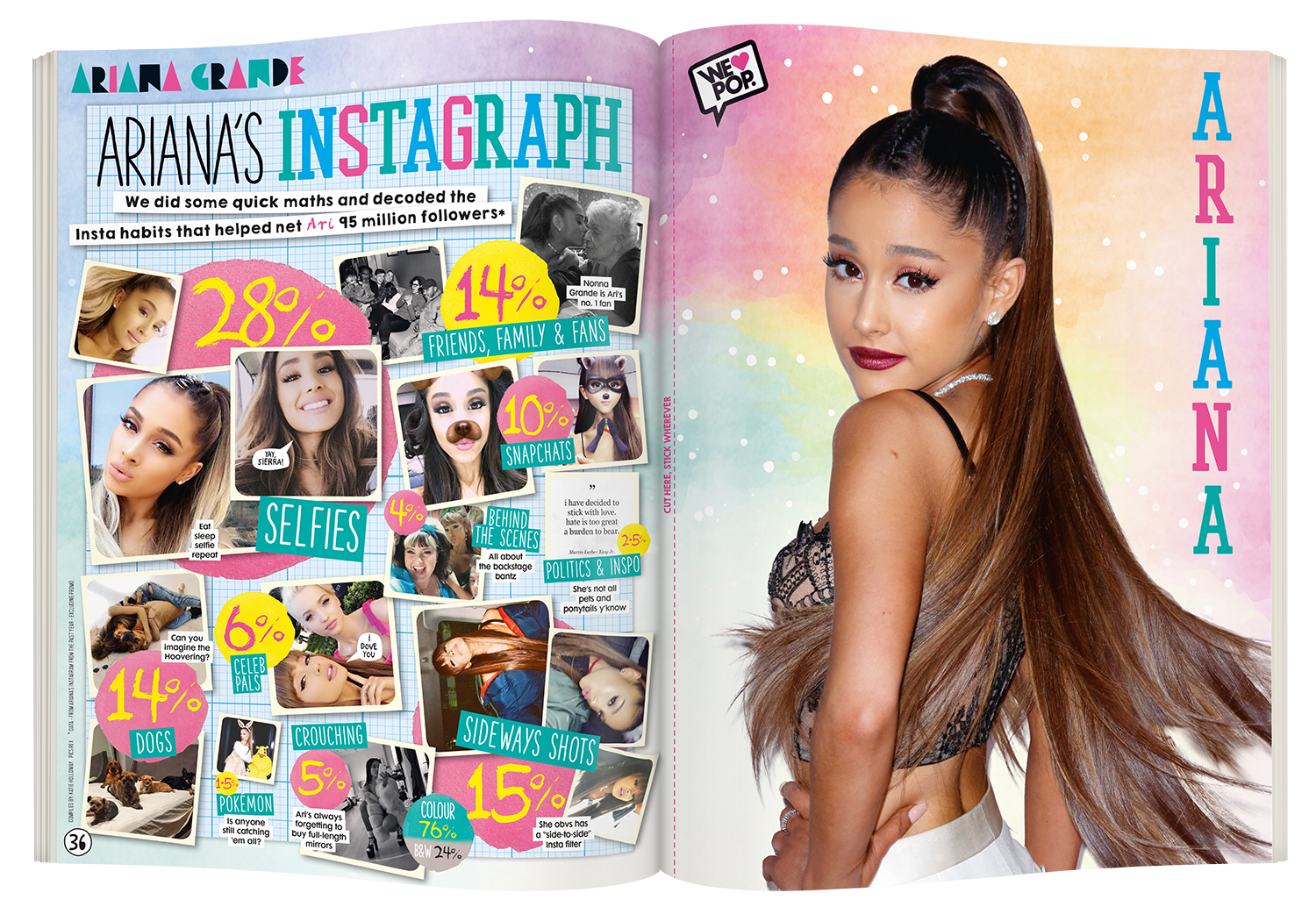
Data journalism, teen-mag style.
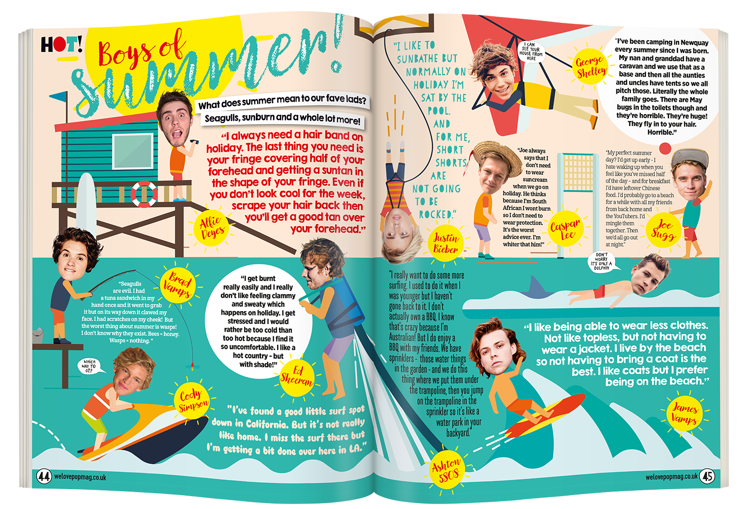
You're thinking "Wow, what a fiendishly complicated full-spread illustration. That must have been tricky to brief", aren't you? And you'd be wrong. The whole thing is a Shutterstock stock image – total cost £5. Thrifty AND nifty.
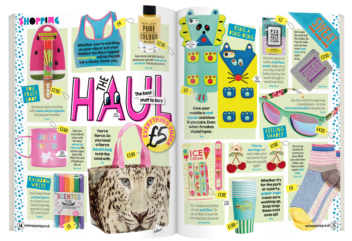
One of the very first magazine pages I ever designed was a shopping page just like this one, for Chatterbox magazine in 1995. I have done approximately 500 similar ones since, so if you have shopping pages that need doing, you are in very safe hands.